


Your designer just sent the link. The new website is ready for review, and you have a meeting in twenty minutes.
Most business owners review a new site the same way: a quick scroll on the laptop, a few thoughts typed into an email, and a promise to look properly later. Later turns into next Thursday, and the launch date slides with it.
It doesn’t have to go that way. Reviewing a website design well takes about 30 minutes if you know what to look for and how to say it. Here’s how to review a website design the way we coach our own clients to do it.
If you’re wondering who’s giving the advice: we’re White Rabbit, a design agency with studios in Los Angeles and Auckland. We’ve reviewed a lot of websites with a lot of clients, and we built a tool to make it easier.
Before you start: know which round you’re in
Good projects review in rounds. Round one is about the big picture: does the structure work, does the look feel like your business? Later rounds are about details: wording, images, the order of things.
Ask your designer which round this is. It stops you rewriting the headline when the real question is whether the page needs to exist at all.
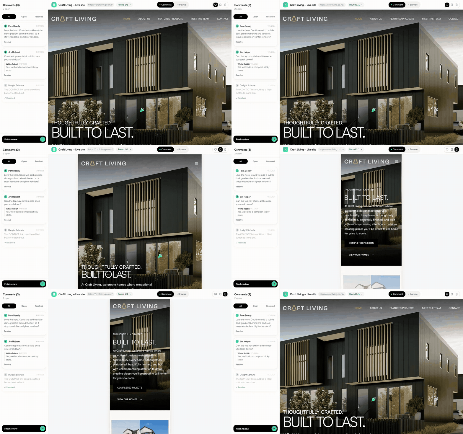
Review on your phone first
Most of your customers will see the site on a phone, so start there. Open the link on your phone and pretend you’ve never heard of your own business.
- Can you tell what you do within five seconds?
- Can you find the phone number or the booking button with your thumb?
- Does any text run off the screen, or any image crop off someone’s face?
Then repeat on a laptop. Note anything that looks different between the two.
Check the words, not just the look
Design reviews often stop at “love the colors”. The words do more of the selling. Read every heading out loud. If a sentence sounds like nobody would say it, flag it.
Check the facts too: opening hours, addresses, prices, team names. Your designer can’t know your Tuesday hours changed last month.

Give feedback your designer can act on
This is where most reviews go wrong. “Make it pop” and “something feels off” are honest reactions, but nobody can act on them. Try this instead.
Point at the exact spot
“The second photo on the About page”, not “one of the photos”.
Say what’s wrong, then what you’d like
“This feels corporate. Could it be warmer, like the photos on our Instagram?”
One comment per change
Five changes in one paragraph means one of them gets missed.
Separate must-haves from nice-to-haves
Your designer will thank you.
We’ve written a longer guide to giving feedback on a website design, with examples of good and vague feedback side by side.
Put all the feedback in one place
If three people on your team are reviewing, collect their comments in one place before they reach your designer. Conflicting notes from different people are the most common reason a website project stalls.
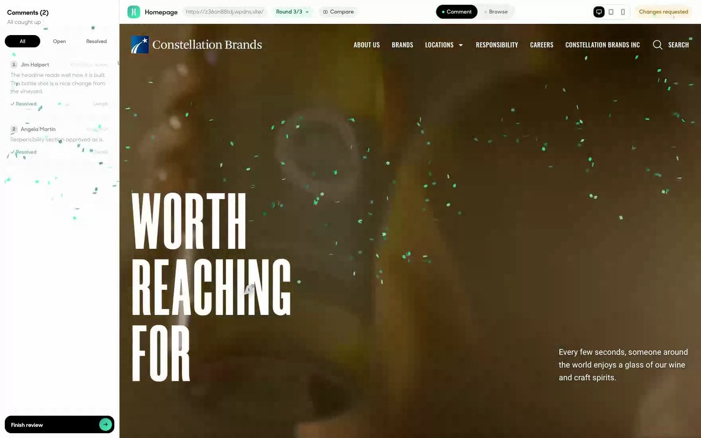
This is exactly why we built HopBack. Our clients open one link, click on anything they want changed, and type. There’s no account to create, and everyone on the team can comment on the same page. When the round is done, they press Finish. When the site is right, they press Approve, and that approval is saved with a name and a date.
We use it on every website project in our LA and Auckland studios. Other agencies now use it too.
Sign off properly
When you’re happy, say so clearly and in writing. A real approval protects you as much as your designer: it records what you agreed to before launch, and it means any later changes are a new request, not an argument about what was signed off.
A website you’ll enjoy reviewing, with White Rabbit
Planning a new site for your Los Angeles business? Our team designs websites with a review process that takes minutes, not weeks.
See our website design work, or book a call and we’ll walk you through how a round works.