

2026 isn’t easing into the year — it’s leaping headfirst into a creative frontier where AI precision collides with the human soul, where color gets louder, motion becomes default, and design feels more alive than ever.
At White Rabbit, we’re already seeing brands across Los Angeles and beyond shift toward bolder visuals, smarter interfaces, and identity-first storytelling. Whether we’re crafting website design for fast-growing startups or refining logo design for established brands, these trends are shaping what audiences will expect in 2026.
Below are the 26 graphic design trends for 2026 set to define the new design decade. And if you want to stand out early, hop on a call with us — we’d love to help bring these trends into your brand’s world.
Here’s what we’re seeing take shape in 2026

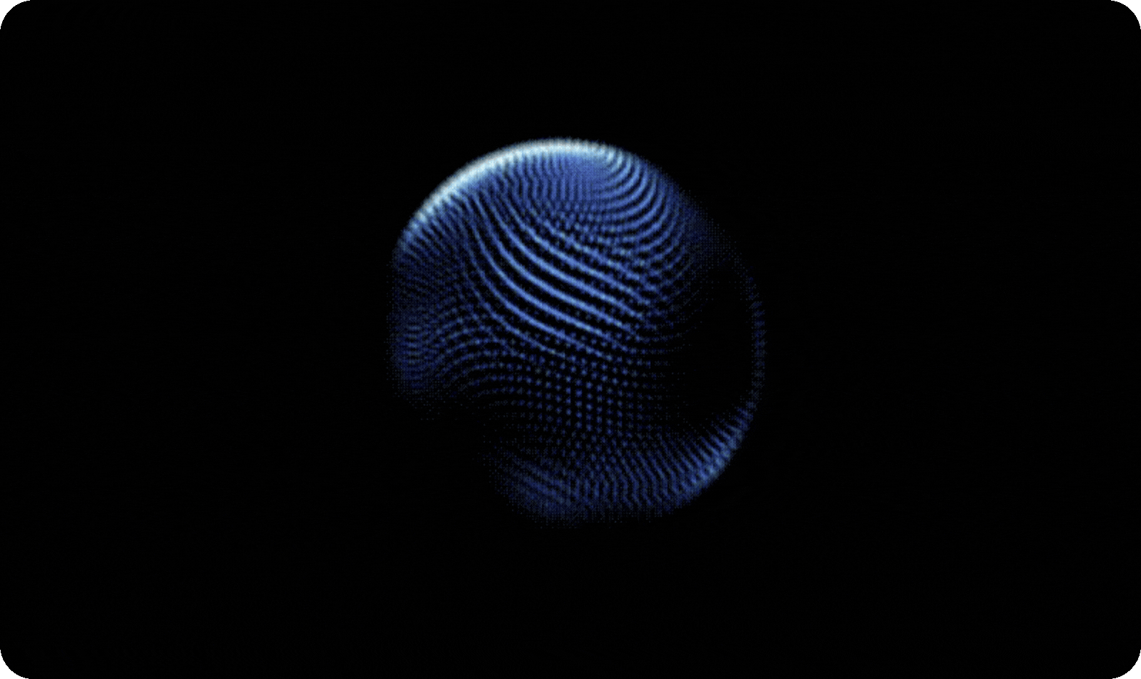
Cyber neon
Glowing strokes, holographic accents, dark interfaces and sci-fi-inspired depth create a futuristic intensity that audiences are gravitating toward. Think dark backgrounds lit with electric blues, purples and greens, floating 3D elements and subtle motion that feels lifted straight from a cinematic interface.
As AR and spatial computing move into the mainstream, this cyber-neon visual language is becoming a natural fit for tech-forward brands that want sharp, energetic identities. Sleek, glowing, sci-fi-inspired visuals are set to dominate 2026 as audiences become increasingly fluent in the futuristic aesthetics popularised by major films and streaming series.

Storybook serifs
Whimsical, literary-inspired serif fonts are making a comeback as brands rediscover the charm of nostalgic storytelling. These expressive letterforms soften digital interfaces and add emotional depth to branding. We use them frequently in iconically warm identity systems and even in print collateral and posters where brands want a touch of enchantment. You can see the same energy in Wicked — both the original Oz books and the film’s lettering lean into fairy-tale nostalgia, which has helped bring these story-driven serif styles back into the spotlight.

Grainy gradients
Clean gradients are being replaced by grainy, atmospheric blends that feel more analog and more human. The subtle noise adds depth and removes the overly sterile AI finish. Many of our clients request this look in packaging, especially in premium consumer goods — and it fits beautifully into custom designs that want warmth without losing sophistication.

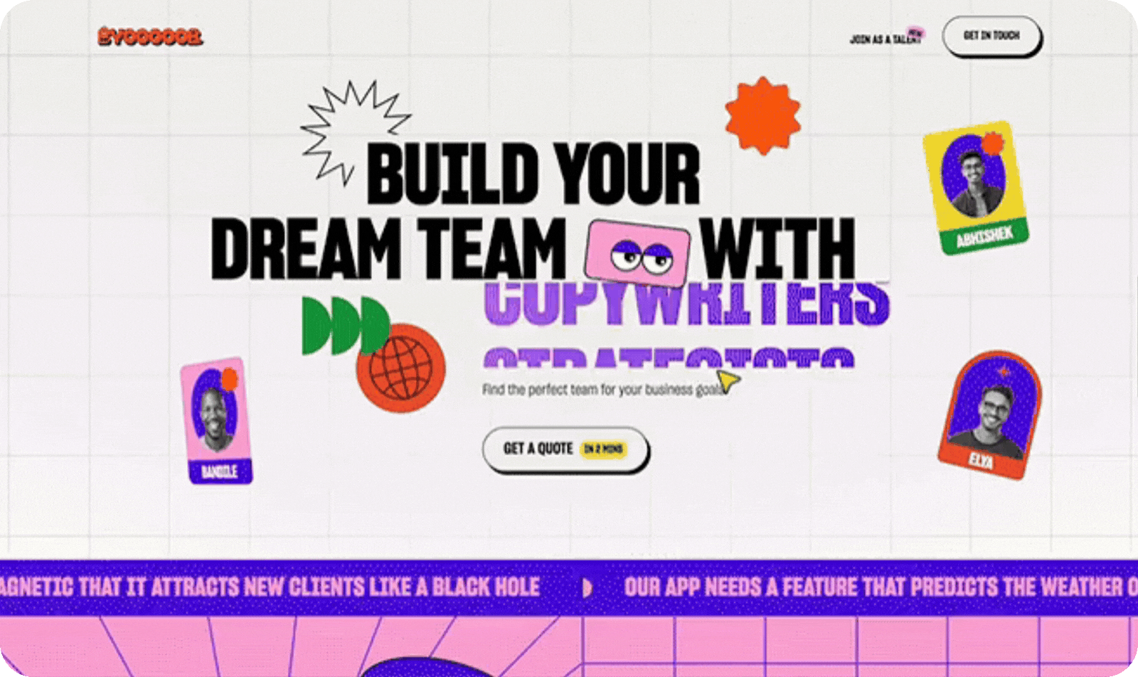
Floating callouts
Designers are adding mini-comments, arrows, labels, notes, and annotation-style bubbles directly into compositions. This meta, almost conversational aesthetic feels playful and transparent, like inviting the viewer behind the curtain. It works exceptionally well for brands with personality, especially when applied across landing pages and startup identity kits.

Imperfect human design
In a world overflowing with AI-generated visuals, imperfect human craftsmanship becomes luxury. Wobbly lines, rough edges, smudges, hand-drawn textures and nods to analog design create deeply human-centered visuals. We’re incorporating these touches into logo design, illustration, and full brand systems for clients who want authenticity over automation — a signature hallmark of our creative style at White Rabbit LA.

Hyper color
Color is getting louder, richer, more neon and more audacious than anything we’ve seen in recent years. Hyper color palettes spark instant excitement and emotion, making them ideal for brands that want to stand out fast. Historically, periods of social and political tension tend to push design in the opposite direction — toward brighter, more expressive and often nostalgic visuals as a form of optimism and escape.
We’re seeing that same shift now, with brands embracing bold colour the way they embrace expressive type, intentionally and with energy. With Stranger Things concluding in 2025, its final season is also expected to reignite love for punchy, 80s-inspired colour pops, reinforcing hyper color as a natural fit for high-impact, interactive design experiences.

Playful naive design
Childlike shapes, uneven lines, spontaneous drawings, quirky characters and doodle-forward illustration bring joy back into branding. Playful design becomes a strategic tool for brands who want memorability and charm without sacrificing professionalism. In particular, we see this working for lifestyle, food, and wellness clients.

Liquid glass
Liquid glass interfaces, a design developed by Apple, blends translucency, soft blur and glossy depth, giving a modern digital polish to designs. It’s especially effective for futuristic user interface design and premium product websites. As an industry leader, Apple is known to set trends in the design industry and we can expect more brands to adopt this style. The result is a sleek, translucent, forward-thinking aesthetic that elevates minimal layouts and makes digital experiences feel refined, responsive and unmistakably modern.

Interactive digital experiences
Static design is fading fast. Digital platforms are becoming more cinematic, responsive and environment-like rather than a series of flat screens. Users now expect experiences that adapt to them in real time — from personalised interfaces to spatial tools like AR that let you drop a product into your own room before buying. This shift has been building quietly over the past few years as technology caught up with expectations. What feels experimental today is set to become mainstream in 2026, with interactive, experience-led design becoming the new baseline rather than a standout feature.

Dynamic cursors
Cursors are no longer just functional pointers — they’re becoming an active part of the digital experience. From shape-shifting states to context-aware interactions, dynamic cursors respond to user behaviour and reinforce brand personality in subtle ways. When designed thoughtfully, they add a layer of tactility and play without overwhelming the interface. Brands focused on memorable, interactive storytelling are embracing dynamic cursors as a small but powerful detail that makes digital experiences feel more intentional, immersive and alive.
Voice user interface (VUI)
Voice-led interactions are becoming a standard part of how people engage with digital products. As voice assistants and smart devices continue to feel more natural and conversational, brands are placing greater emphasis on how they sound as well as how they look. Strong VUI design focuses on tone, clarity and personality to create seamless, human-centred experiences. Done well, it allows brands to extend their identity beyond screens and into everyday, hands-free moments.

Modular layouts
Modular layouts dominate brand systems thanks to their flexibility. Each visual block can be moved, remixed, repurposed and expanded across platforms without losing consistency. This is a core part of how we design adaptable brand systems, especially for clients using our startup business design packages, where scalability matters.
Variable fonts
Responsive typography is a major part of new website design trends in 2026. Variable fonts allow brands to adapt type weight, width and optical sizing dynamically. They load faster, animate beautifully and deliver cleaner visual flow across screens — perfect for a polished, high-performance digital presence.

Deconstructed grids
Designers are now intentionally breaking structured grids to create controlled chaos — offset blocks, loosened alignments, asymmetrical spacing and drifting elements that still feel purposeful. This direction works beautifully in editorial-style layouts and even across brochure design when brands want an elevated, artsy feel. It also helps move design away from the overly polished, formulaic look often associated with AI-generated layouts, introducing more human judgment and creative nuance. In a landscape full of sameness, deconstructed grids give brands a distinctive way to stand out while still keeping content clear and engaging.
Neo-brutalism
Neo-brutalism strips design back to essentials: shape, structure, color blocks and striking clarity. It’s brutalism reimagined for a digital world — easier to digest, more refined, and visually bold. Brands adopting this trend pair it with soft type or motion for balance.

Sustainable packaging aesthetics
Sustainable packaging is driven by the materials and structures behind it. Brands are increasingly choosing recycled and recyclable substrates like kraft paper, sugarcane, hemp fibre, algae pulp and post-consumer cardboard to reduce environmental impact without sacrificing quality. Compostable films and plastic alternatives are replacing traditional laminates and wraps, while structural designs focus on less paperboard, fewer layers and reduced glue points. The result is packaging design that feels considered, honest and premium, with sustainability designed into every layer.

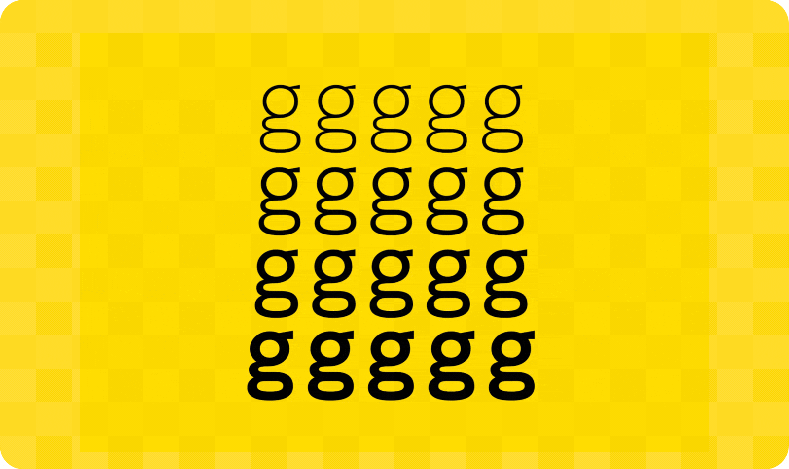
Expressive shape-shifting type
Type that stretches, wiggles, bends, rotates and responds to surrounding elements transforms text into art. Expressive type is one of the biggest visual signatures of 2026 because it injects movement and personality. We use this in digital hero sections, identity systems and campaign creative for clients who want lettering that speaks loudly.

Candid low-fi photography
Lo-fi photos — flash moments, camera-roll chaos, motion blur and accidental frames — are replacing sterile, overproduced imagery. This authenticity-first aesthetic makes branding relatable, especially for younger audiences. It pairs beautifully with expressive type and modular layouts.

Micro-industrial design
Micro-industrial design borrows from engineering, manufacturing and technical systems to create a look that feels precise and intentional. Think stamp-style details, micro-notes, barcode-inspired elements, grid references and label-side markings used as graphic accents rather than decoration. This approach is gaining traction with lifestyle and tech brands that want a structured, sophisticated aesthetic — one that signals function, craft and credibility without feeling cold or overly mechanical.

Increased 3D elements
3D visuals are now accessible to brands of all sizes thanks to new tools and smart workflows. Whether it’s 3D icons, floating objects, 3D lettering, or interactive environments, the dimensionality adds richness digital design previously lacked.

Motion as a baseline
Motion isn’t a feature anymore — it’s an expectation. Kinetic type, hover animations, scroll-based transformations and subtle micro-movements elevate a brand’s digital presence dramatically. Our digital clients often choose dynamic animation early in the project process because it gives their brand instant presence.

Tall and narrow grotesque typefaces
Condensed grotesque type continues to thrive thanks to its unmistakable visual authority. It works brilliantly in both print and digital branding where bold messaging matters. Combined with grain or glow, it becomes a deeply modern signature.

Cute, bubbly, “Digi-Cute” maximalism
Digi-Cute maximalism leans playful, expressive, and unapologetically fun. Think glossy icons, candy-colored gradients, inflated shapes, and UI elements that feel touchable. This style borrows from kawaii culture, Y2K nostalgia, and app-native aesthetics to create brands that feel alive on screen. Brands use Digi-Cute maximalism when they want personality turned all the way up — layered visuals, joyful motion, and a look that feels digital-first rather than print-adapted.
Nailed-down micro-fiction
Tiny one-sentence stories — poetic, sharp, emotional or unexpected — appear across packaging labels, website headers and campaign visuals. These micro-fiction moments build brand personality instantly, even in the smallest spaces.

AI chatbots & smart assistants
AI chatbots and smart assistants are becoming a natural part of modern websites, helping brands engage visitors in real time. They’re being used to answer questions, guide users, qualify leads and reduce friction across the customer journey. When designed thoughtfully, these tools feel helpful rather than intrusive, supporting users exactly when they need it. For brands, smart assistants offer a practical way to boost engagement, streamline enquiries and drive conversions without overwhelming the interface.

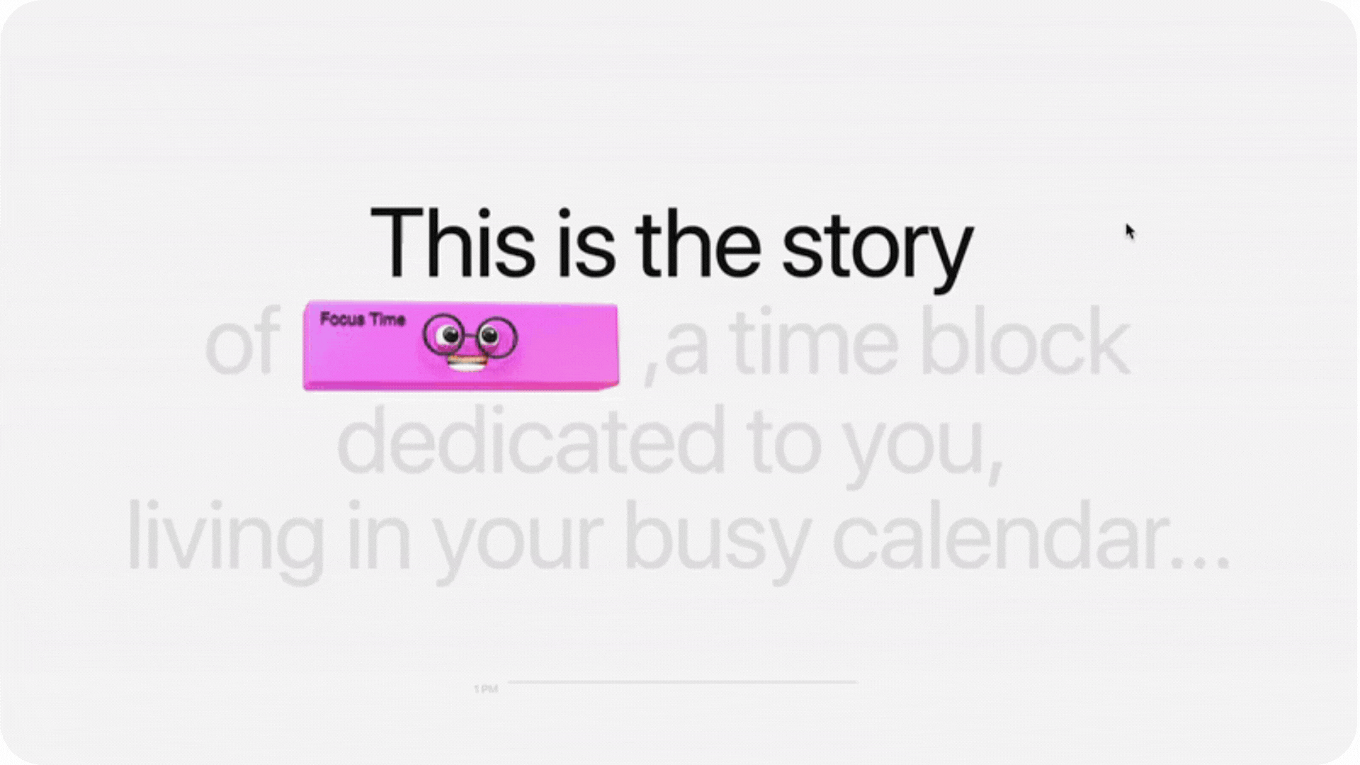
Mascots and characters
Mascots are evolving into fully fledged brand characters — playful, expressive, glossy and a little weird in the best way. They give brands instant memorability and create assets that live easily across digital campaigns, packaging and interactive experiences. More importantly, they make brands feel approachable and distinct online.
As AI-generated design, automation and machine-driven content accelerate, brands are looking for human anchors. A strong character adds personality, warmth and emotional connection in ways AI still can’t convincingly replicate. In a sea of slick, minimal, same-same branding, mascots cut through fast and help shift identities from purely aesthetic to story-led and memorable.
Ready to bring these trends to life? Hop to it with White Rabbit
The design world is moving faster than ever — and the brands that win in 2026 are the ones who embrace motion, personality, futuristic UX, expressive type, and human-centered creativity. If you want to bring any of these trends into your brand identity, take a peek at our work.
At White Rabbit, we don’t just follow design trends — we build brand worlds that stand out, spark curiosity, and outpace the competition. Let’s create something unforgettable together.