Packaging used to shout. Neon colors. Endless gradients. Visual noise doing laps around the shelf like an over-caffeinated bunny. Today, the brands winning attention are doing the opposite. They’re simplifying. Stripping back. Choosing restraint over chaos. That’s why 2 tone package design has quietly hopped to the front of the pack.
This shift is not about aesthetics alone. It’s about clarity, speed, and confidence. Two colors force decisions. They remove distractions. They make typography pull its weight. When done well, 2 tone package design feels deliberate, modern, and surprisingly bold in a sea of visual clutter.
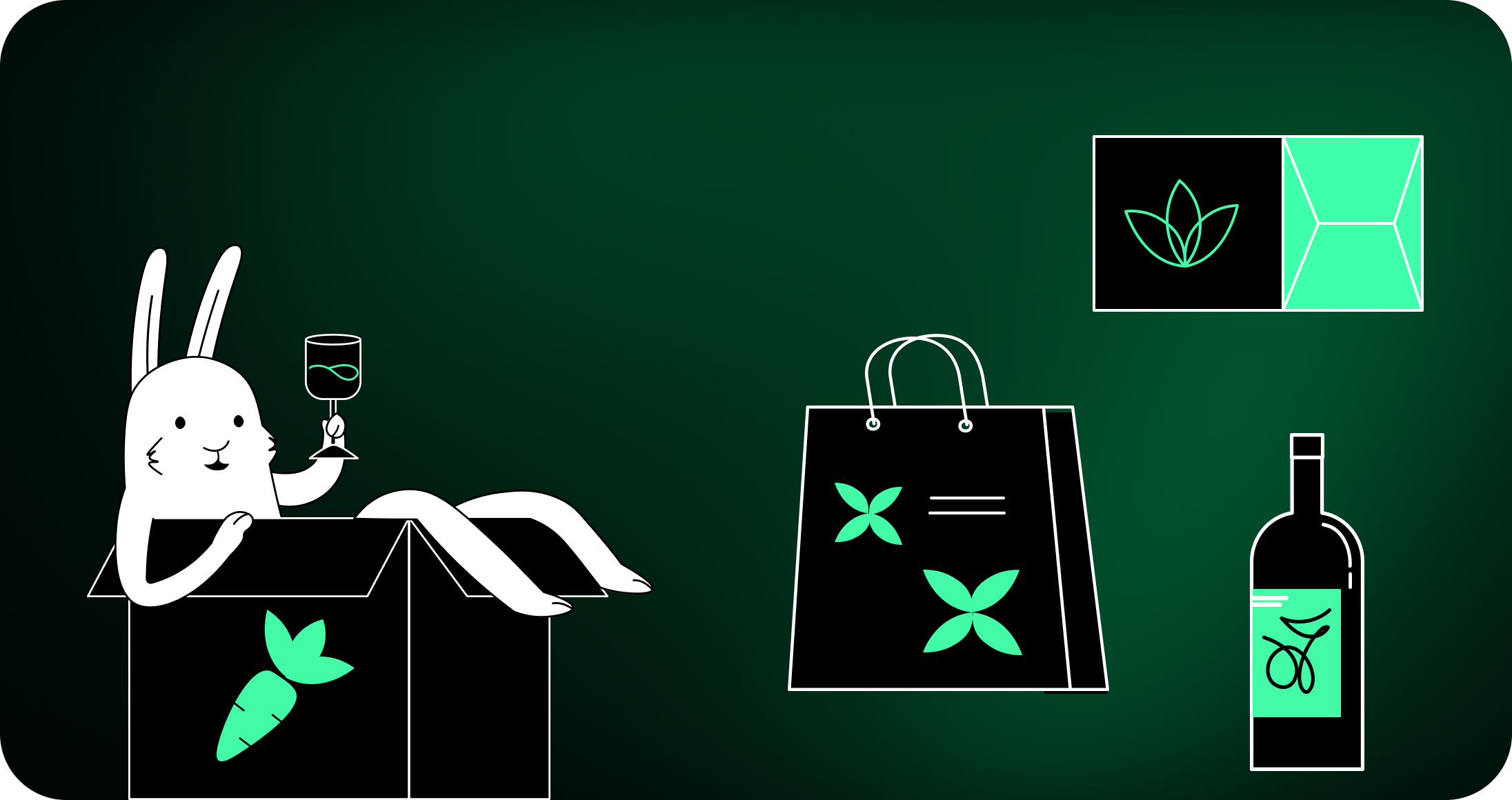
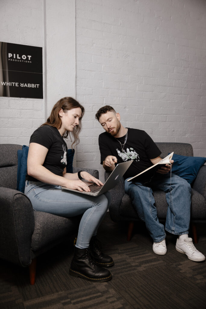
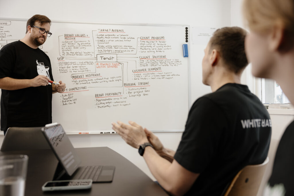
We’re White Rabbit, a full service design agency based in Los Angeles, and we help brands turn trends like this into scalable systems across branding, packaging, print, digital, and beyond. If you want packaging that works harder than a rabbit before spring, you’re in the right burrow.
Why it’s everywhere right now
At its core, 2 tone package design uses two dominant colors to carry the entire visual system of a package. Not accents. Not a rainbow hiding in the shadows. Two colors doing the heavy lifting together.
This approach demands discipline. With fewer colors to rely on, hierarchy, spacing, typography, and layout suddenly matter a lot more. There’s nowhere to hide weak decisions. That’s exactly why this style feels sharper and more confident when executed well.
You’re seeing it everywhere because brands are realizing that simplicity scales. Two colors reproduce more consistently. They photograph better. They read faster on shelves and screens. In a world where consumers decide in seconds, clarity wins — especially when paired with thoughtful packaging design that considers real-world use.
How 2 tone package design is leading modern design trends
This isn’t a random aesthetic swing. The rise of 2 tone package design is a response to how people actually shop today.
Shelf fatigue and visual overload
Walk down any aisle and your eyes get tired before your feet do. Brands compete by adding more, which only creates more noise. Two-tone packaging cuts through by doing less. High contrast and clear hierarchy help products stand out without yelling. Calm wins attention when everything else is shouting.
Digital-first packaging and social media visibility
Packaging now lives online as much as it does on shelves. Thumbnails, ecommerce grids, Instagram posts. Two colors read instantly at any size. 2 tone package design survives compression, cropping, and bad lighting better than complex palettes. It also plays nicely with cohesive website design and digital brand systems, where consistency matters just as much as impact.
Cost-effective design without looking cheap
Limiting colors often reduces production complexity, but the real advantage is consistency. Fewer inks mean fewer surprises. When paired with strong typography and materials, two-tone packaging feels intentional, not budget-driven. The trick is knowing where to invest, which is where experienced packaging teams earn their carrots.
How 2 tone package design creates stronger brand clarity and brand recognition
Two colors force focus. That’s the magic trick.
Visual hierarchy with fewer distractions
When color options are limited, hierarchy becomes clearer. Logos, product names, and key information don’t compete for attention. They take turns. This makes packaging easier to scan and easier to remember — especially when supported by strong logo design and brand guidelines.
Color contrast and brand recall
Strong contrast builds memory. When consumers recognize a color pairing before they read a word, you’ve done something right. Over time, those two colors become shorthand for your brand. That’s powerful positioning with very little visual noise.
Packaging as a silent brand ambassador
Packaging speaks when no one else is there. 2 tone package design communicates confidence, restraint, and maturity. It signals a brand that knows who it is and doesn’t need to shout about it. That message lands quietly, and effectively.
Best color combinations for packaging in a two-tone system
Color choice is where strategy shows up or falls apart.
High-contrast color pairings
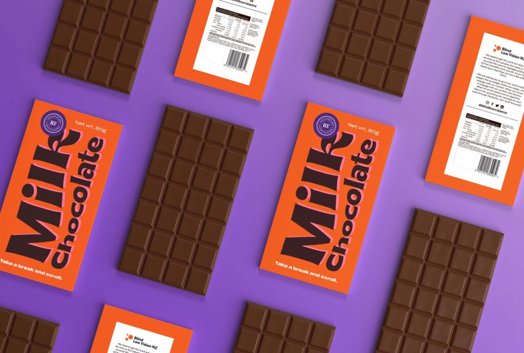
Black and white. Navy and cream. Deep green and warm beige. High contrast works when clarity matters most. These pairings are legible, bold, and timeless. They’re especially effective in crowded retail environments.
Neutral plus bold accent colors
A neutral base paired with a confident accent color creates balance. Structure plus personality. This approach gives brands flexibility without losing cohesion, especially across product lines and printed materials like brochure design.
Muted two-color palettes for premium products
Muted palettes shine in wellness, beauty, and lifestyle categories. Soft contrast feels considered and calm. Paper choice, finishes, and print quality do more of the talking here, so details matter.
2 tone design vs multi-color packaging designs
Two colors are powerful, but they aren’t a universal solution.
When two colors outperform complex palettes
Two-tone works best when clarity, scalability, and recognition matter. It’s ideal for brands refining their identity or expanding product lines. Fewer variables mean fewer mistakes as you grow.
When multi-color packaging still makes sense
Illustration-heavy brands, playful products, and storytelling-driven packaging sometimes need more color to communicate emotion. The key is intention, not restraint for restraint’s sake.
Choosing the right approach for your product
The decision comes down to audience, category, and goals. This is where strategic discovery pays off — especially for early-stage brands exploring startup business design packages to set strong foundations from day one.
How 2 tone package design fits into a scalable brand system
Good packaging doesn’t live alone. It connects to everything.
Creating cohesive product lines
Two-tone systems make it easier to build families of products that feel related without looking repetitive. Consistent layouts with flexible color pairings create visual harmony across shelves and ecommerce platforms.
Flexibility for line extensions
New flavors, sizes, or variations can be introduced by rotating colors within a defined system. That keeps recognition high and production efficient — a big win for growing brands.
Consistency across packaging design trends
Two-tone systems age well. They adapt to evolving styles without needing constant reinvention. That longevity saves time, money, and a lot of unnecessary hopping back to the drawing board.

Common mistakes brands make with 2 toned packaging
Even simple systems can stumble.
Weak color contrast
If colors don’t contrast enough, readability suffers. Testing across lighting conditions and materials is critical. Screens lie. Print tells the truth.
Poor typography choices
Typography carries more weight in two-tone systems. Weak fonts, overcrowding, or poor spacing become obvious fast. This is where experienced designers earn their keep.
Treating two-tone as a trend instead of a system
Copying the look without the strategy leads to short shelf life. Two-tone works when it’s part of a bigger brand framework, not a one-off aesthetic experiment.
Why working with a full service agency matters
Design decisions don’t happen in isolation.
Strategy-led color decisions
Color should follow positioning, not personal taste. Strategic discovery ensures color choices align with brand goals and audience expectations.
Seamless collaboration across branding packaging and print
When branding, packaging, print, and digital live under one roof, systems stay consistent. That cohesion shows up everywhere — from physical packaging to campaigns, case studies, and even large-scale visuals like billboards and banners.
One point of contact and clear communication
Business owners and marketing teams benefit from fewer handoffs. One team. One process. Fewer dropped carrots along the way.
Bring your 2 tone package design to life with a full service design partner
When it comes to packaging design, the answer is simple: it’s often the first handshake between your brand and your customer. White Rabbit helps brands turn 2 tone package design styles into scalable systems that work across packaging, websites, and marketing materials.
From concept to execution, we keep things clear, cohesive, and surprisingly fun. Explore our work or contact us when you’re ready to build something that stands out without shouting.