
The design world is hopping into 2026 with palettes that are bolder, softer, moodier, cleaner, and frankly more emotionally charged than anything we’ve seen in a decade. If you’re a business owner or creative decision-maker, staying ahead of 2026 color trends isn’t just about looking cool online — it’s about signaling relevance, trust, innovation, and clarity the moment someone lays eyes on your brand. Color is fast. Color is emotional. Color is the first handshake before your copy even loads.
This year’s trends aren’t random. They’re shaped by AI fatigue, economic optimism (and pessimism), a craving for grounding, a fascination with futurism, and the collective urge to escape into something that feels less… beige. So instead of easing into the topic, let’s jump in paws-first and unpack what will actually move the needle for your brand in 2026.
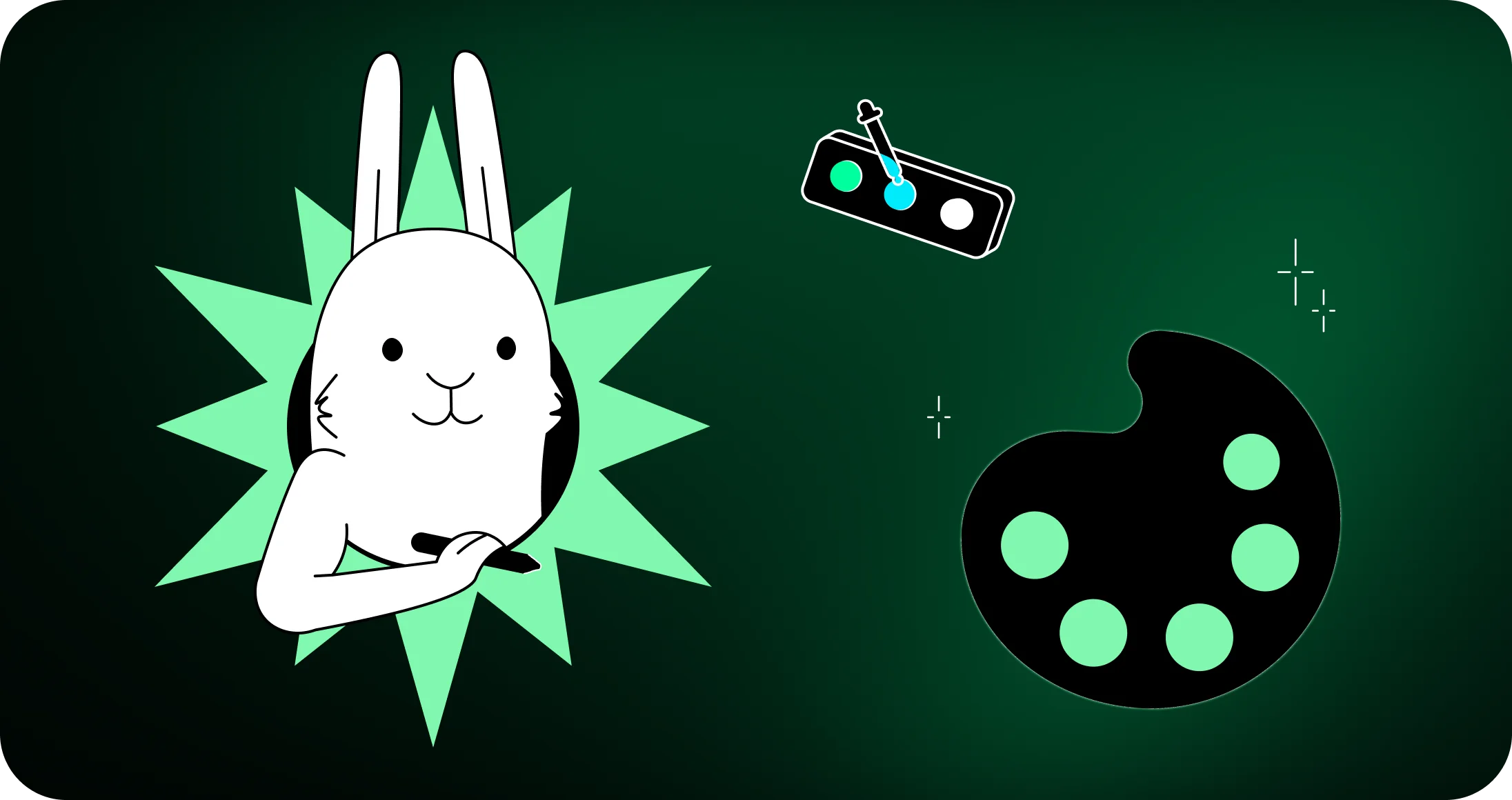
At the end of the day, choosing the right palette is much easier with a creative partner who knows how to make your visuals hop off the page. At White Rabbit, we help brands build unforgettable identities through branding, websites, packaging, illustration, and more. If you’re ready to elevate your visuals with expert designers and a streamlined creative process, take a peek at our work and let’s make something beautiful together.
Why 2026 color trends matter for modern brands
The fastest way to lose a customer is to look out of date. One scroll, one tap, one glance — that’s all it takes for a potential buyer to decide whether you’re worth their attention. Color works like psychological shorthand. It creates trust, sparks emotion, and communicates brand maturity long before someone reads a single word. If you want proof, think of how many times you’ve hopped onto Google — or, if you’re living dangerously, Bing — and instantly judged a company’s credibility by its design.
2026 color trends matter because this year’s palettes reflect deep cultural undercurrents. People want grounding and escape. Calm and energy. Humanity and futurism. When brands hit this sweet spot, they feel instantly modern — and instantly memorable.
At White Rabbit, we help businesses tap into this visual psychology with cohesive, future-ready branding that works across web, print, packaging, and everything in between. With a fully integrated team of senior designers, your palette doesn’t just look good — it performs.
How color influences purchasing behavior
Color guides decision-making faster than rational thought. Blues build trust. Greens calm the nervous system. Warm tones feel social and welcoming. High-chroma shades cue innovation and momentum. When businesses embrace these psychological drivers intentionally, conversions hop in the right direction.
Why trends shift in predictable cultural cycles
Trends don’t shift because someone in Paris declared periwinkle “The Next Big Thing” (though that never hurts). They shift because of economic pressure, cultural mood, generational taste, and technology. Right now we’re in a “dual reality” cycle — craving both grounding and digital surrealism — which explains why 2026’s palette has both earthy minerals and AI-infused neons sharing the same carrot patch.
How 2026 aesthetics shape brand perception
A brand that uses cutting-edge color signals innovation, confidence, and awareness. A brand that clings to outdated hues communicates stagnation. 2026 palettes shape how people perceive your company long before they understand what you offer. Designers must treat color as an active strategic tool, not a decorative afterthought.
The biggest 2026 color trends shaping design this year
Let’s hop straight into the core trend forecast. Three forces dominate: grounding naturals, hyper-synthetics, and off-black minimalism. Together, they define color trends 2026 more dramatically than any year prior.
The shift toward natural, grounding palettes
Consumers are craving calm. As screens get louder, colors get softer. Expect to see botanicals, minerals, clay tones, desert neutrals, and misty greens dominating wellness, food, hospitality, architecture, and lifestyle branding.
The rise of digital-first, high-impact hues
On the opposite end of the spectrum: neon-leaning hues designed for bold web experiences. High-impact, high-contrast chromatic shades feel futuristic and energetic — a perfect match for tech, startups, entertainment brands, and brands targeting younger audiences.
Why hybrid palettes define the 2026 design landscape
Combine naturals + synthetics and you get the “human tech” palette ruling 2026. Warm terracotta with electric cyan. Pearl grey with spectral magenta. Clay beige with laser blue. These pairings tell a story — grounded yet innovative, calming yet energetic. A perfect reflection of modern brands walking a line between authenticity and acceleration.
Neo-naturals and earth-inspired tones
Neo-naturals are not your 2019 beige renaissance. They’re richer, more mineral-driven, and layered with emotional depth. These tones speak to environmental reconnection, wellness, slower living, and earthy sophistication. Small businesses in lifestyle, beauty, food, and wellness benefit enormously from palettes that feel tactile and intentional.
Mineral neutrals and calming greens
Think of shades pulled straight from coastal rock faces, river stones, eucalyptus leaves, and fog-covered hills. These tones create stability and trust — a major win for businesses that want a soothing, premium presence.
Bio-based browns and clay-infused pigments
Warm clay, oxidized terracotta, deep cocoa, and mossy browns are making a comeback. They feel handcrafted and grounded but modern enough to work for contemporary branding.
How natural palettes support wellness-driven branding
The demand for nature-inspired color comes from the collective craving for calm. Brands in health, beauty, and hospitality are leaning heavily into this direction because it signals warmth, care, and authenticity.
Hyper-synthetics and the future of digital color
Move over pastels — the internet wants high-voltage boldness. Hyper-synthetics are AI-friendly, screen-optimized, and tailor-made for attention retention. These colors dominate motion graphics, gaming visuals, fintech interfaces, and high-impact campaign creative.
Electric and AI-generated chroma tones
Electric teal. Plasma pink. Laser magenta. Spectral cyan. These runway-bright tones feel hyperreal and energetic. They’re perfect for brands that want to communicate innovation and disruptiveness.
Iridescent gradients for web and motion graphics
2026 is the year of liquid-glass gradients, shifting holographics, and multi-stop blends. These gradients add depth and dimension to modern interfaces and pair beautifully with neutrals for balance.
When bold digital colors outperform neutrals
For call-to-action buttons, launch campaigns, entertainment platforms, and youth-oriented brands, these intensely bright tones outperform minimal palettes. They shout — but strategically.
Off-black evolution: the quiet luxury palette for 2026
True black is harsh. Off-black is sophisticated. This palette is dominating luxury branding, boutique packaging, tech dashboards, and editorial design. It’s moody without being heavy — a versatile base for expressive palettes.
Graphite and smoky charcoal shades
Graphite, ink-wash charcoal, slate, obsidian green-black — these subtly tinted blacks add dimension where pure black flattens everything.
Understated luxury for branding and packaging
Pair off-blacks with metallic accents or matte finishes and your packaging instantly feels high-end. Businesses wanting an elevated, premium perception can lean on this palette heavily. And yes — this is where packaging design truly shines.
Balancing off-blacks with vivid or muted accents
Because off-black is softer, it plays nicely with both grounded naturals and neon-driven synthetics. Designers can create extremely modern compositions by pairing soft charcoal with cobalt or clay.
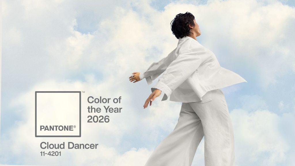
Pantone’s color of the year for 2026: cloud dancer
Cloud Dancer — a warm, airy off-white — was announced as the color of the year of 2026 by Pantone’s selection. This isn’t your grandma’s white paint. Cloud Dancer symbolizes clarity, simplicity, and a cultural desire for a “visual reset” after overstimulation.
Why off-white is gaining global traction
Neutral minimalism isn’t going anywhere; it just continues evolving. Cloud Dancer offers a clean, flexible foundation adaptable across branding, interiors, digital design, and product packaging.
Pairing cloud dancer with stronger tones
It pairs beautifully with cobalt, clay, graphite, spectral pinks, and even citrus-driven yellows. Treat it like a breath of fresh air in your palette.
When minimalist palettes deliver maximum impact
Minimal doesn’t mean boring. It means intentional. When supported by stunning typography and thoughtful layout — something logo design and branding experts specialize in — minimal palettes become unforgettable.
2026 web design color trends transforming digital experiences
Digital platforms need colors that behave well across screens, dark mode, light mode, accessibility requirements, and motion. This is where 2026 web design color trends come into play.
Soft tech blues and confidence-driven UI tones
These blues strike the perfect balance between calming and credible. Vapor-blue gradients and ice-washed hues give interfaces a modern, friendly tone.
High-contrast dual color systems for hierarchy
Dual-tone systems help users scan quickly. Clay + cobalt. Off-black + neon. Pearl white + electric teal. They improve usability instantly and make CTA elements hop off the screen.
AI-enhanced gradient applications in modern interfaces
Gradients aren’t about nostalgia anymore — they’re about depth, dimension, and visual clarity. Liquid blends and iridescent tints offer a dynamic modern feel that performs well in UI animation.
Color psychology and emotional drivers behind 2026 palettes
Color shapes perception on a subconscious level, influencing mood, trust, and attention in seconds. Cool tones calm the nervous system and signal stability, while warmer hues activate energy, creativity, and emotional warmth without overpowering the design.
Color works because it hits emotion before logic. And in 2026, brands must strike a delicate emotional balance:
Why audiences crave both calm and stimulation
People are overwhelmed by digital noise but still want to be surprised. It’s why neo-naturals and hyper-synthetics coexist. A split-personality palette? Sure. But aren’t we all?
Human-centered color strategy for small businesses
Color strategy becomes powerful when aligned with brand voice, values, and audience expectations. This is especially important for small businesses trying to stand out in crowded markets.
Aligning palette choices with brand values and messaging
Colors should reflect who you are — not what’s trending. Trends are inspiration, not instruction. And a skilled agency blends both effortlessly.
How full-service design agencies help brands use 2026 color trends strategically
Color becomes exponentially more powerful when branding, website, packaging, brochures, and campaigns all harmonize. That’s exactly why working with a full-service agency matters.
Translating trend insights into practical brand systems
Trends are only helpful when they translate into flexible, scalable brand guidelines. White Rabbit specializes in building color systems that feel modern now — but still relevant in three years.
Avoiding inconsistent or outdated palette selections
When businesses hire multiple vendors, chaos hops into the brand. A full-service agency eliminates that risk through unified creative control.
Streamlining revisions with expert project management
White Rabbit’s team keeps everything on track — designers, illustrators, developers, photographers — all aligned under a single point of contact. Your project stays cohesive from start to finish.
If your brand is ready to leap into the world of modern color, White Rabbit is here to help. Explore our website design services, check out our work, or hop over to contact us to get started. Let’s make your 2026 palette unforgettable — one bold, strategic color choice at a time.